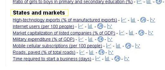
Google today made available the Google public data explorer, a Google labs project, for restricted use. The product is restricted right now, only in terms of the data available for analysis and viewing. The main utility of this application is in the simplicity with which you can sift through vast arrays of data. For example, I looked at their World Development Indicators data set. I was interested in analyzing the states and market data in this collection. A screen grab is shown below,
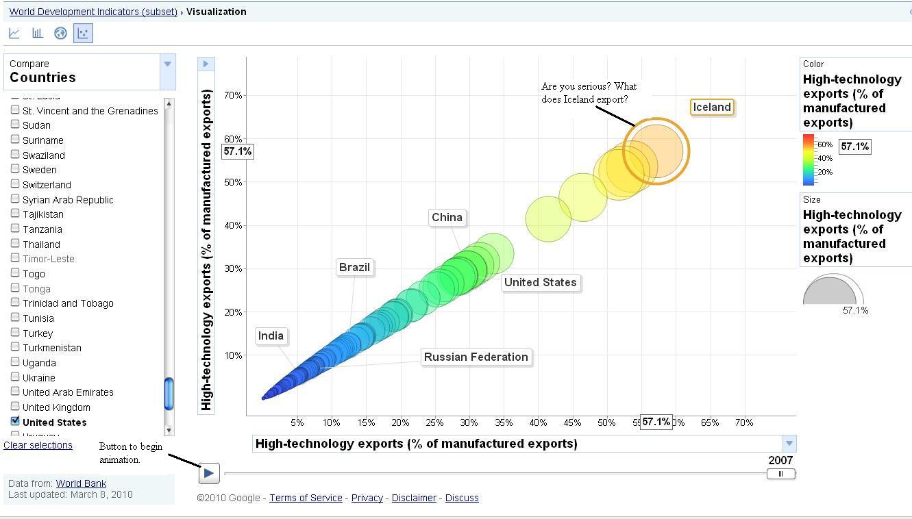
Now, I specifically wanted to check what percentage of manufactured exports came from the high technology sector. By default, you will find a graph that shows that percentage for the entire world, which in this case is 18.1% in 2007. I now wanted to compare this number against that for India, China, Brazil, Russia and the United States. This link is the default line graph for the selected data, and shows very clearly and concisely that the US and China exported a huge percentage of manufactured goods from their high tech industry. From the definition of high tech goods, we can also pretty crudely infer that these two countries spent a lot more money on R&D, higher education, and probably had more qualified manpower. Just to make it interesting, I wanted to see how these countries fared over a period of time, to determine how their economies evolved through that period. This is the great feature in GPDE (Google Public data explorer), we can visually track the bubbles( can be chosen by clicking on the last icon amongst the choices at the extreme left) that represent different countries with their relative sizes specifying the percentage of exports coming from the high tech sector ( see below).
OK, the fun part begins when you click on the start button. You observe that China which was on par with Brazil and India until 1993 starts puling away rapidly, until it reaches the US in 2004 and surpasses it in 2006. This representation just gave us an idea as to how a particular country works, its policy making priorities and its ability to go through with its thought process. A sociologist would probably love this tool and would certainly have better insights into what all this data means.
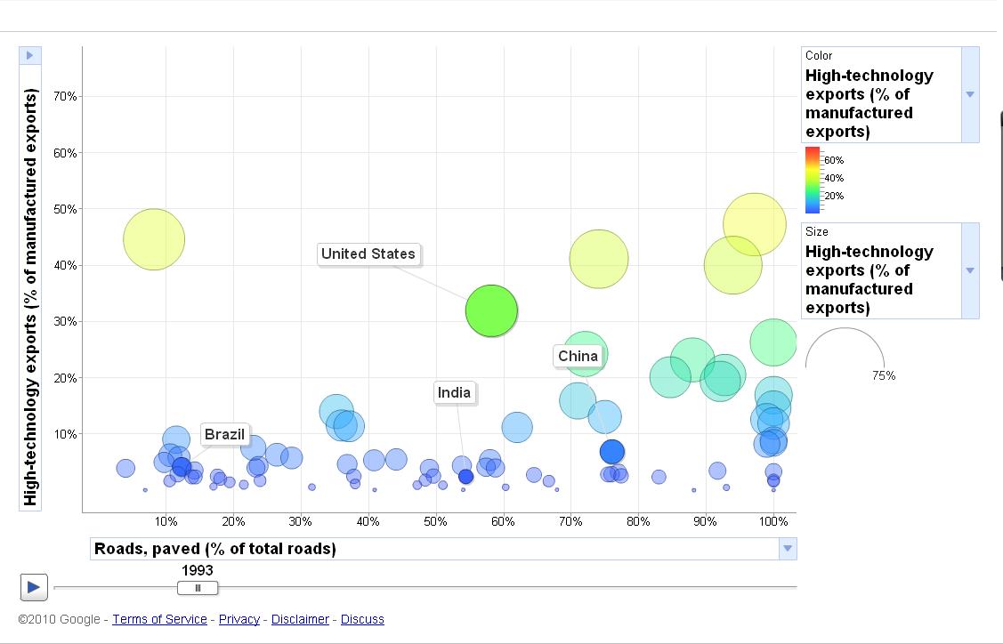
I wanted to make this more interesting. I felt, that the infrastructure in a country has a direct correlation to its ability to produce, market and ship high tech products or for that matter, products from any sector. So, I went ahead and changed the X-axis to reflect my need for an additional constraint of knowing the percentage of paved roads in that country. The next image shows the status of roads in 1993 and the link to the animation will show how they progressed up until 2007.
 What the animation proves is that there is a direct correlation between the infrastructure in the state and the levels of industrial production. I am no economist nor a sociologist, but I find this tool interesting and informative. But it is not without its flaws. I have put together what I feel works for this tool and what doesn't.
Pro's:
- Easy to learn
- Intuitive interface
- Rich representation
- Good to get a quick insight before going on to more complex data analysis
Con's:
I understand its still in the labs but, I would have loved to see the ability to make the other bubbles disappear once I checked the few which I wanted to track.
The ability to change colors of the bubbles and especially the lines that point to those bubbles ( I can't see them on my computer!)
More data sets. I am sure students will love it. Enjoy this talk by the phenomenal Hans Rosling at TED. Have fun!


No comments:
Post a Comment